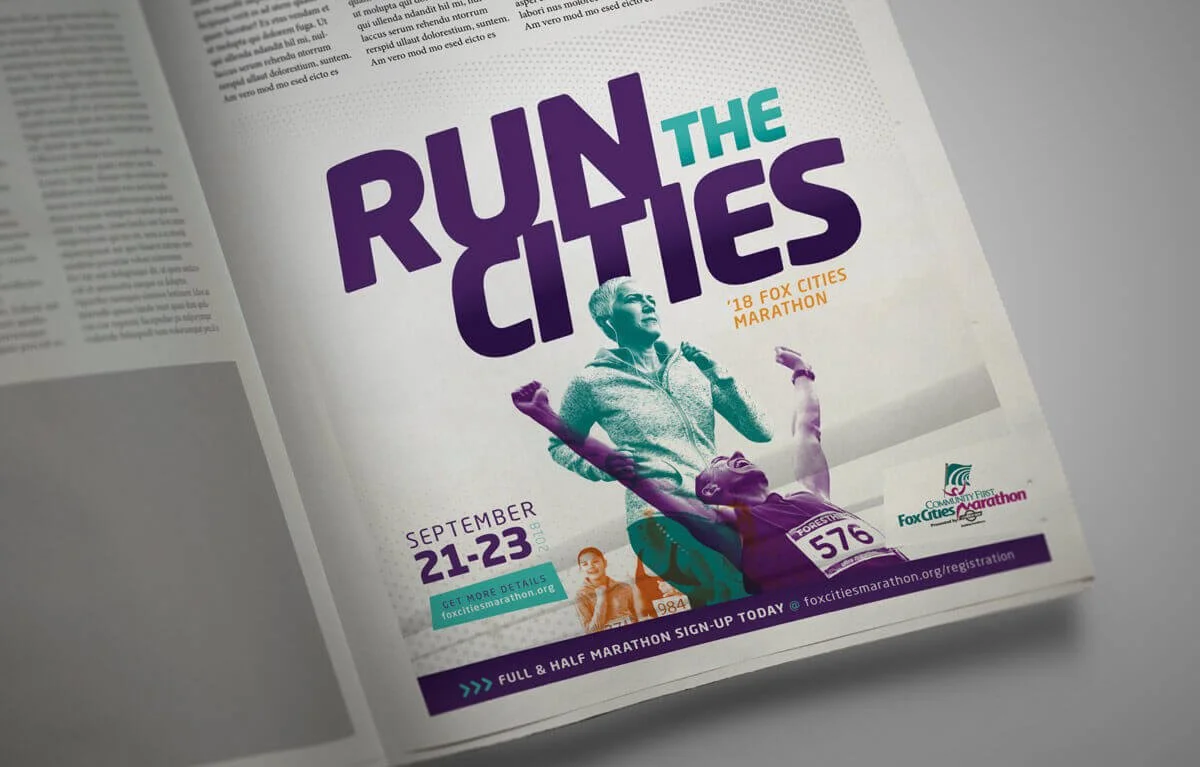
Since 1991, the Fox Cities Marathon has been the heartbeat of the community. We decided to brand this event “Run The Cities,” a reimagined marathon experience that’s more than a race. To reflect this exciting change, we've infused the event with bright, vibrant colors and dynamic photo treatments.
The photo treatments feature bold duotone imagery, creating a striking visual contrast that highlights the energy and motion of the event. Bright, vibrant colors infuse every aspect of “Run The Cities.” From bright greens to electric blues, our palette is designed to energize and inspire. Angles and geometric shapes are featured, creating a sense of movement that mimics the flow of the race. These elements guide the eye and capture the motion of the marathon. Our choice of the Neo Sans font is deliberate and impactful. Its sleek, modern lines embody motion and progress, perfectly complementing the energy of “Run The Cities.” The typography is not just a design element; it’s a visual representation of the marathon’s spirit.


