The Gannett Imaging & Ad Design Center has undergone a transformative rebrand, emerging as designIQ. This bold new identity captures our agency-like approach to design, marketing, and media buying, offering a fresh perspective for both B2B and B2C clients.
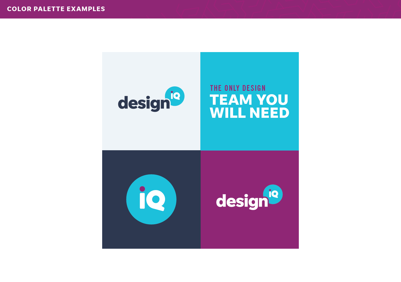
Our rebrand journey began with crafting a name that embodies our innovative spirit. The logo features a bold typeface and a vibrant teal blue circle, housing a dynamic 'IQ' with a purple dot on the 'i'.
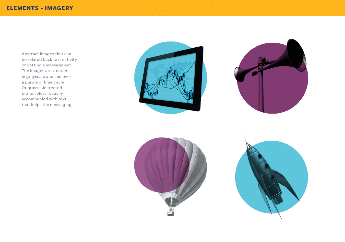
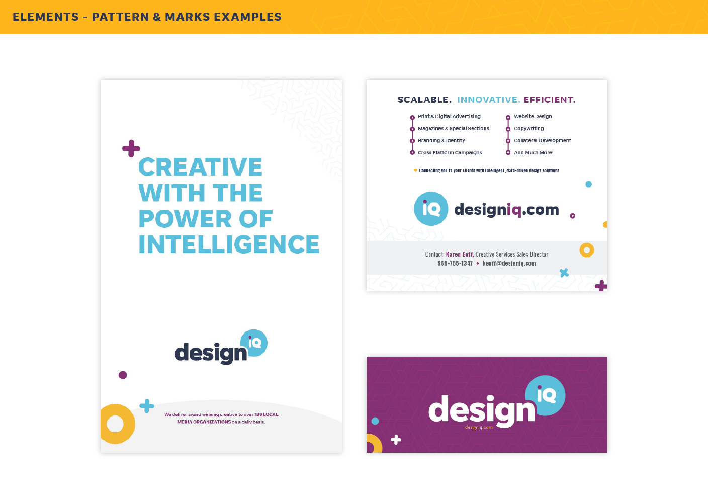
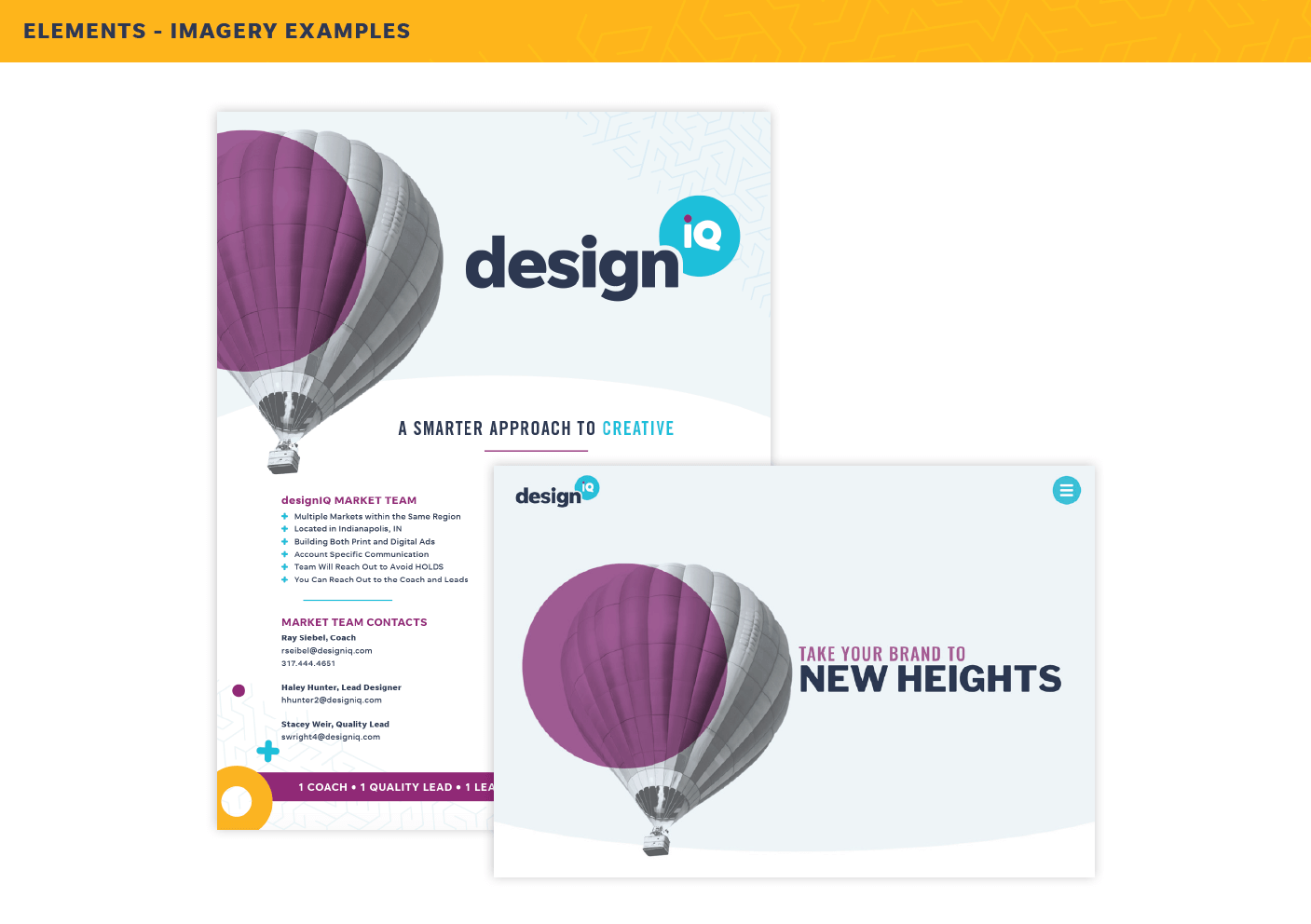
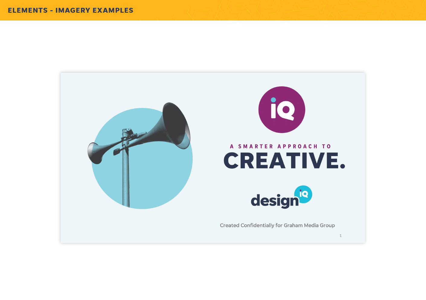
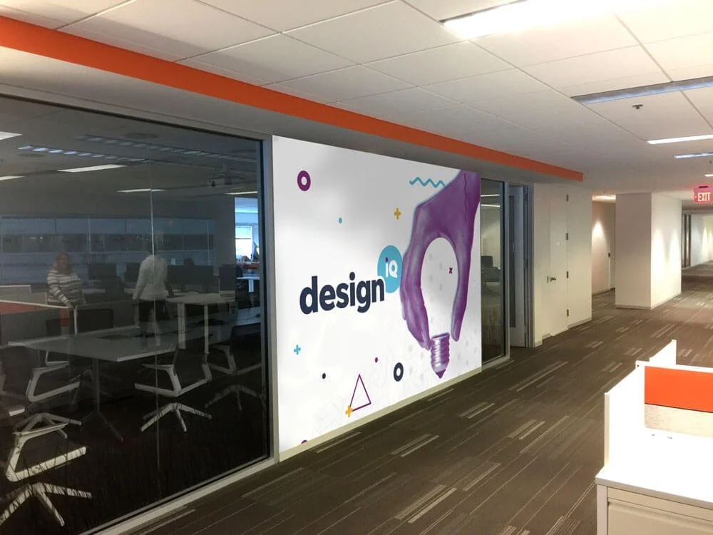
The visual identity of designIQ consists of a rich palette of vibrant blues, purples, and yellows, accented by a complementary dark blue. Our imagery simplifies our capabilities with duotone effects and 3D graphics, all designed with a sense of fun and creativity. Our brand guide emphasizes a playful yet professional vibe, with illustrated shapes and a strong focus on typography, blending big, bold fonts with sleek, condensed typefaces.
The rebrand extends to our new website, where you’ll experience the same bright colors and simple design. www.designiq.com


